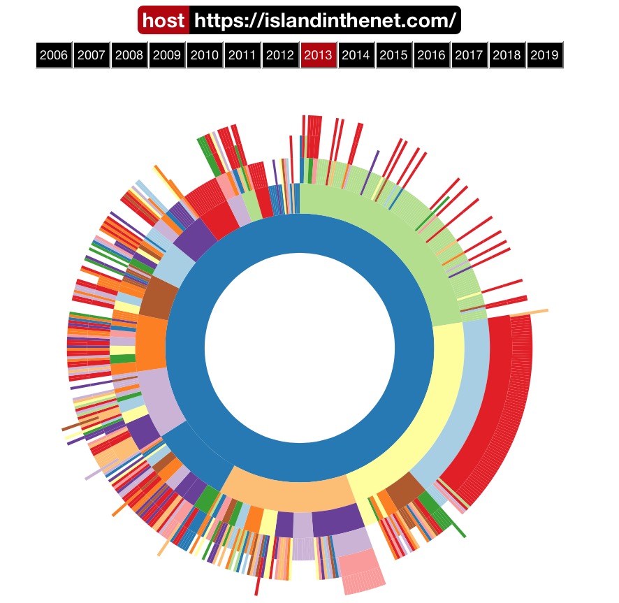
Today I saw a note that led me to the Internet Archive which I know has recently had a redesign. I’m not sure if the functionality I saw was part of this redesign, but it’s pretty awesome. I’m not sure quite what to call this sort of circular bar chart given what it does, but circular widthmap seems vaguely appropriate.
Instead of using color gradations to indicate a relative number of posts, the UI is measuring things via width in ever increasing concentric circles. The innermost circle indicates the root domain and successive levels out add additional paths from my site. Because I’m using dated archive paths, there’s a level of circle by year (2019, 2018, 2017, etc.) then another level outside that by months (April 2019, March 2019, etc.), and finally the outermost circle which indicates individual posts. As a result, the width of a particular year or month indicates relatively how active that time frame was on my website (or at least how active Archive.org thinks it was based on its robot crawler.)
I enjoyed the idea of these heatmaps and charting. I added the sparkline graph last week after I saw them on Chris's website. I may create a separate web site page to keep these. I don't know how useful they are, but they are just cool. I would also love a way to display some of the JetPack graphs.
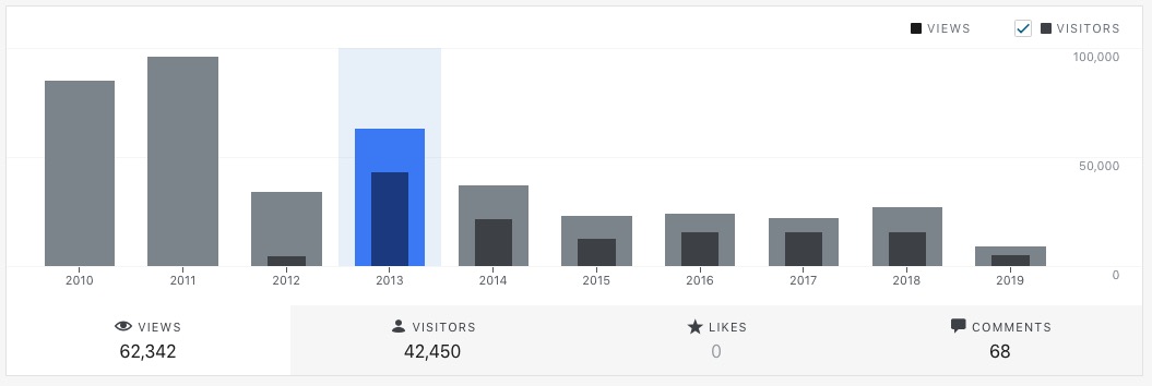
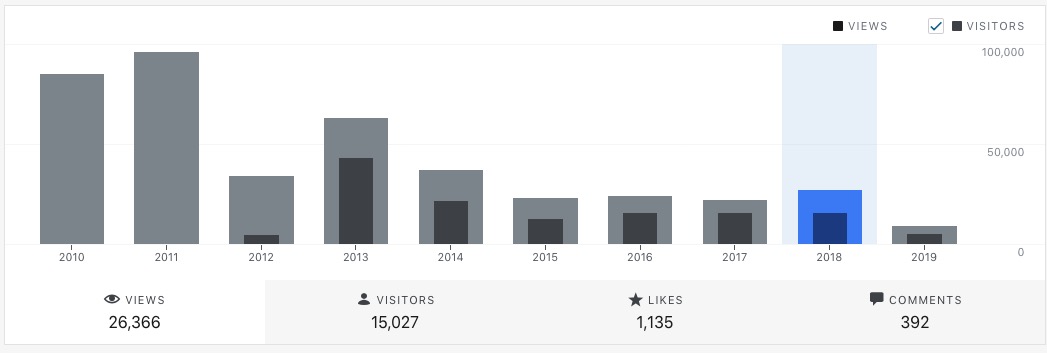
These are the yearly JetPack stats from 2010, the year Automattic first offered the, to 2019.
2013 was the best year for this website.
But I get more "responses" that I did in earlier years. I suspect more of these are from semantic responses on other platforms, Facebook, Twitter, Instagram since. It's, and the time I started using some of the IndieWeb software.
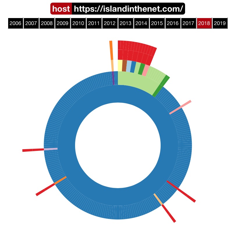
Below is the Internet Archive graph for 2018, compared to 2012. Traffic has fallen off.
2013 Internet Archive Circular Widthmaps2018 Internet Archive Circular Widthmaps
A human who works in information security and enjoys photography, Formula 1 and craft ale.
We use cookies on our website to give you the most relevant experience by remembering your preferences and repeat visits. By clicking “Accept”, you consent to using ALL the cookies. However, this website has no interest in selling your information. It does not explicitly use social media cookies from Facebook, Google, Twitter, Threads, Instagram etc. Read More
This website uses cookies to improve your experience while you navigate through the website. Out of these, the cookies categorized as necessary are stored on your browser as they are essential for the working of basic functionalities of the website. We also use third-party cookies that help us analyze and understand how you use this website. These cookies will be stored in your browser only with your consent. You also have the option to opt out of these cookies. But opting out of some of these cookies may affect your browsing experience.
Necessary cookies are absolutely essential for the website to function properly. These cookies ensure basic functionalities and security features of the website, anonymously.
Cookie
Duration
Description
cookielawinfo-checkbox-analytics
11 months
This cookie is set by GDPR Cookie Consent plugin. The cookie is used to store the user consent for the cookies in the category "Analytics".
cookielawinfo-checkbox-functional
11 months
The cookie is set by GDPR cookie consent to record the user consent for the cookies in the category "Functional".
cookielawinfo-checkbox-necessary
11 months
This cookie is set by GDPR Cookie Consent plugin. The cookies is used to store the user consent for the cookies in the category "Necessary".
cookielawinfo-checkbox-others
11 months
This cookie is set by GDPR Cookie Consent plugin. The cookie is used to store the user consent for the cookies in the category "Other.
cookielawinfo-checkbox-performance
11 months
This cookie is set by GDPR Cookie Consent plugin. The cookie is used to store the user consent for the cookies in the category "Performance".
viewed_cookie_policy
11 months
The cookie is set by the GDPR Cookie Consent plugin and is used to store whether or not user has consented to the use of cookies. It does not store any personal data.
Functional cookies help to perform certain functionalities like sharing the content of the website on social media platforms, collect feedbacks, and other third-party features.
Performance cookies are used to understand and analyze the key performance indexes of the website which helps in delivering a better user experience for the visitors.
Analytical cookies are used to understand how visitors interact with the website. These cookies help provide information on metrics the number of visitors, bounce rate, traffic source, etc.
Advertisement cookies are used to provide visitors with relevant ads and marketing campaigns. These cookies track visitors across websites and collect information to provide customized ads.