
I stumbled upon Scott Wyden's 2012 blog metrics from Google Analytics, presented as an infographic1. In an attempt to face my own blogging reality, I decided to do the same.
As expected, the results are not what I had hoped for after a decade of blogging. Less than half of my web traffic comes from the US, with a scattered readership across the globe. Europe accounts for most of my international readers, though it remains relatively small.
Most of my audience uses WebKit-based browsers, especially Safari, which aligns with my focus on Apple-based products in 2012. This is evident in the platform preferences of my readers, with 63% being Mac users. However, the fact that only 11% of my readers are repeat visitors means my posts are not compelling. Admittedly, I know that my posts need improvement, considering that the average time spent on my site by readers is just 18 seconds. I have much work to do to grow my community of readers.
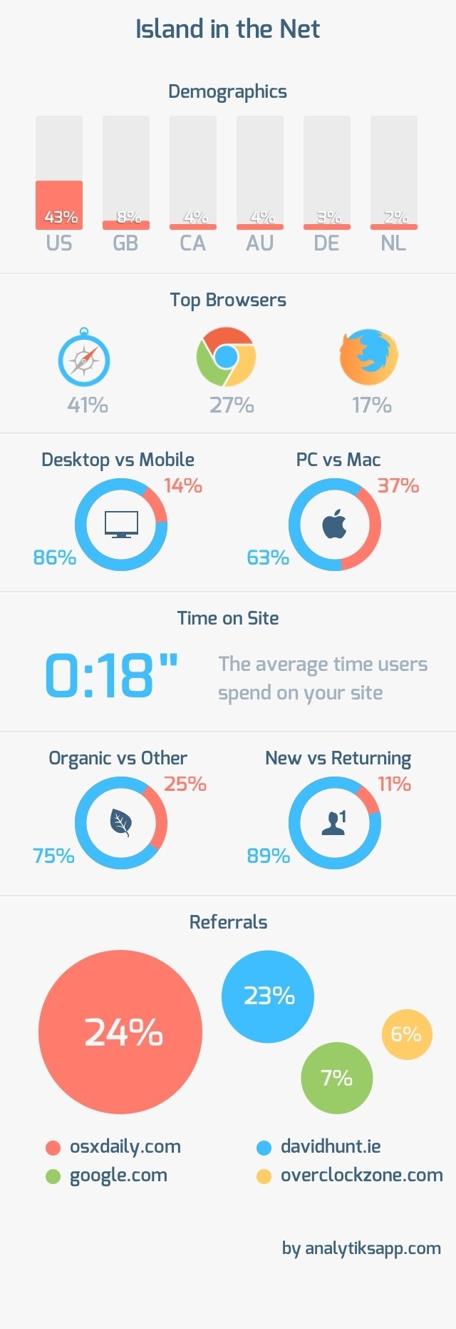
The referrals show that OS X Daily significantly drove traffic to my blog in 2012. I must post more commentary on that site.
That app for sure has beautiful output … you're tempting me to buy it 😀
As on the stats I think that 'hobbist' bloggers like us (who do NOT blog as a full time job) can never tell what people will really like and what not. Sometimes on my italian blog (10 years old next february) I do receive a lot of feedback on things I would never think to be so interesting in searches.
My point on bloggin is to do it and enjoy it without any sense of obligatory commitment. Also I do like your' summoning 'personal' things up to one main space and leave to other some specific, highly focused, topic on external, specific projects.
P.S. = am I the only reader from Italy? 😀
I think you are my only reader from Italy but the blog recently received a lot of readers from Germany via Spiegel.de. There was article about my Raspberry Pi project that was interesting to the open source readers.
Wow. Mine were quite different: Most visits were from Opera.
Seth, very few people in the USA even know about Opera. I think the three major browsers here are Firefox, Chrome and Internet Explorer. Safari is mostly used by Apple owners -- Mac or iPad/iPhone.
Thanks for the shout out, buddy! Your stats may not be where you want, but that's why you look at them... to find where to improve so you can think of ways to improve.
How did you get the images? Screenshots?
The Analytiks app has an export function. It exports the entire infographic as an image to the Photos app.